Where Milestone #1 Left Off
In Milestone #1, a shift happened.
What began as a task management app gradually became something else. By working backward from user needs, I realized the central object was not a list of tasks, but an energy curve—how a person’s state changes throughout the day.
That realization raised an immediate question:
How do you turn something as abstract as “energy” into something you can actually compute?
The Search for a Model
The moment I started researching, I found that this problem had been studied for decades—primarily in contexts I hadn’t expected: military operations, aviation safety, and shift-work scheduling.
These fields share a common concern: predicting when someone will be too fatigued to perform safely. Lives depend on getting it right. So they developed mathematical models, tested them rigorously, and published their findings.
I looked at four major approaches.
Two-Process Model (Borbély, 1982)
The foundation of modern sleep science. Alexander Borbély at the University of Zurich proposed that alertness is governed by two independent processes:
- Process S (sleep pressure): rises exponentially while awake, falls while asleep
- Process C (circadian rhythm): a 24-hour sinusoidal wave independent of behavior
The math is elegant:
Awake: S(t) = μw - (μw - S₀) × e^(-t/τw)    τw ≈ 18.2h
Asleep: S(t) = μs + (S₀ - μs) × e^(-t/τs)   τs ≈ 4.2h
Over 40 years of research has validated its core principles. But elegance has limits: the model doesn’t know whether you slept well or poorly, can’t detect if you’re sick or stressed, and treats all waking hours identically.
Three-Process Model (Åkerstedt & Folkard, 1997)
Developed at Stockholm University as an extension, adding a third component:
- Process U (sleep inertia): the grogginess upon waking, dissipating over 15-30 minutes
This model outputs predictions on the Karolinska Sleepiness Scale (KSS, 1-9). More realistic, but still shares the fundamental limitations: no awareness of sleep quality, no differentiation between activities.
Commercial Black Boxes (WHOOP, Oura)
Modern wearables integrate multiple physiological signals—HRV, resting heart rate, temperature, sleep stages—into a single “readiness score.”
The user experience is polished. But the algorithms are completely opaque. And research has shown something counterintuitive: these composite scores often correlate poorly with actual physiological state. The raw signals—HRV and RHR—are frequently more reliable predictors than the processed score.
SAFTE (Walter Reed Army Institute, 2003)
Sleep, Activity, Fatigue, and Task Effectiveness. Developed under Department of Defense funding by Steven Hursh. The original patent (US Patent 6,579,233) has expired.
This is the most widely deployed fatigue model in commercial aviation and military operations. The FAA uses it. Airlines use it. The U.S. Army uses it.
What caught my attention was its core metaphor: energy as a reservoir.
Sleep → fills the tank
Waking → drains the tank

Effectiveness = Reservoir × Circadian × (1 - Inertia)
Three components:
- Sleep Reservoir: capacity 2880 units, drain rate 0.5 units/min
- Circadian Oscillator: 24h + 12h dual-period wave
- Sleep Inertia: 10% effectiveness reduction upon waking, decaying gradually
A water tank. Simple enough to visualize, flexible enough to extend.
The Decision
SAFTE stood out because it was designed to be extended. The reservoir model is fundamentally agnostic about what fills or drains it. You can add activity types. You can adjust recovery based on sleep quality. You can plug in physiological signals.
The other models were more rigid—elegant in their simplicity, but harder to adapt to new inputs.
So I chose SAFTE as the foundation. But the original version had a problem.
The Problem with Soldiers
SAFTE was designed for military personnel. The parameters reflect that context.
The original reservoir capacity is 2880 units—enough to stay functional for 48 hours without sleep. The circadian peak is set at 18:00, optimized for missions that run through the night. Sleep inertia is calibrated for people trained to wake up alert.
None of this matches a knowledge worker’s daily rhythm.
I needed to recalibrate.
From 48 Hours to 16 Hours
A white-collar worker isn’t trying to stay awake for two days. They’re trying to get through 16 waking hours with enough energy to be effective at each task.
So I reduced the reservoir from 2880 to 960 units—a one-third scale that maps to a normal day. This cascaded through every other parameter:
| Parameter | Military | Civilian | Why |
|---|---|---|---|
| Reservoir capacity | 2880 | 960 | 16h vs 48h design |
| Sleep recovery max | 3.4 | 1.5 | Match new capacity |
| Circadian peak | 18:00 | 10:00 | Morning productivity |
| Sleep inertia max | 10% | 15% | Normal people wake slower |
| Inertia decay rate | 0.07 | 0.05 | ~30 min to clear |
The circadian peak shift was significant. Military operations often happen at night, so evening alertness matters. But for someone working a typical schedule, the cognitive peak is mid-morning. This one change reoriented the entire model around daylight productivity.
Activities Are Not Equal
The original SAFTE treats all waking time identically. An hour of deep coding drains the same energy as an hour of scrolling social media.
This is obviously wrong.
I introduced activity multipliers—coefficients that modify the base drain rate:
DRAINING ACTIVITIES (↓)          RECOVERY ACTIVITIES (↑)
─────────────────────────        ─────────────────────────
High Stress  ████████ -19%/hr    Nap    █████████████ +25%/hr
Deep Focus   █████    -12%/hr    Sleep  ███████████   +15%/hr
Work         ███      -6%/hr     Meal   ██████        +10%/hr
                                 Rest   ██            +4%/hr
Now a meeting-heavy afternoon drains energy faster than a quiet one. A power nap provides more recovery than just sitting on the couch. The model starts to reflect lived experience.
How Energy Flows
Here is a typical day, visualized:
     RECOVERY              DRAIN              RECOVERY
    ←────────→         ←──────────→         ←────────→

🌙 SLEEP ━━━━━┓ 🧠 DEEP WORK ━━━━━┓ 🍽️ MEAL ━━┓ 💼 WORK ━━┓ 😰 STRESS ━━┓ 😌 REST ━━━━┓ 🌙
              ┃                   ┃          ┃          ┃            ┃            ┃
00    07    08    12    13    15    17    19    22    24
      ↑      ↑           ↑                     ↑           ↑
    WAKE  START       LUNCH               DINNER       SLEEP
           WORK
And the energy curve that results:
100% ┤
     │    ┌──┐
 90% ┤    │  │ Wake up fully charged
     │   ╱    ╲
 80% ┤  ╱      ╲
     │ ╱        ╲ Deep Focus drains fast
 70% ┤╱          ╲
     │            ╲           ┌─┐ Dinner recovery
 60% ┤─────────────╲─────────╱  ╲──────────  ← Low energy threshold
     │              ╲       ╱    ╲
 50% ┤               ╲     ╱      ╲
     │                ╲   ╱ Rest   ╲
 40% ┤─────────────────╲─╱──────────────────  ← Critical threshold
     │                  V Lunch boost
 30% ┤                  ↑
     │              Low point
     └──┬────┬────┬────┬────┬────┬────┬────┬
       00   04   08   12   16   20   24
The thresholds matter:
┌─────────────────────────────────────────────────────────┐
│  100% ████████████████████████  Full energy            │
│                                                         │
│   60% ████████████░░░░░░░░░░░░  Low - time to rest     │
│                                                         │
│   40% ████████░░░░░░░░░░░░░░░░  Critical - need rest   │
│                                                         │
│    0% ░░░░░░░░░░░░░░░░░░░░░░░░  Empty                  │
└─────────────────────────────────────────────────────────┘
Running the Simulation
When I ran a 7-day simulation with a “typical busy schedule,” the results were striking.
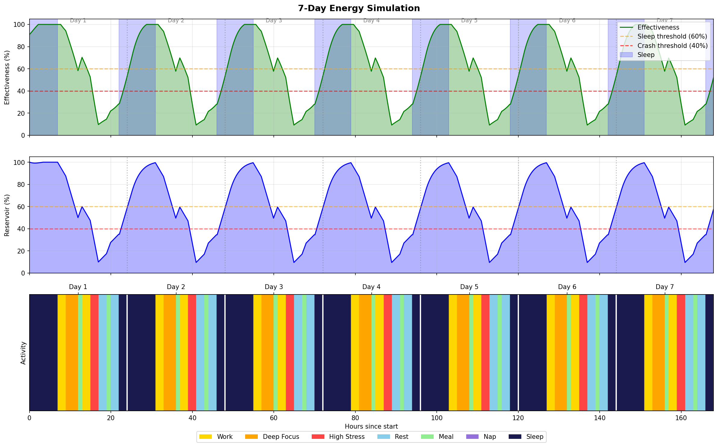
The pattern repeats: energy crashes below the critical threshold every single day. The default schedule included 3 hours of deep focus (-36%) and 2 hours of high stress (-38%). Total drain exceeded what meals and evening rest could restore.
This wasn’t a bug. It was the model showing what an unsustainable schedule actually looks like—quantified.
A single day view shows the dynamics more clearly:
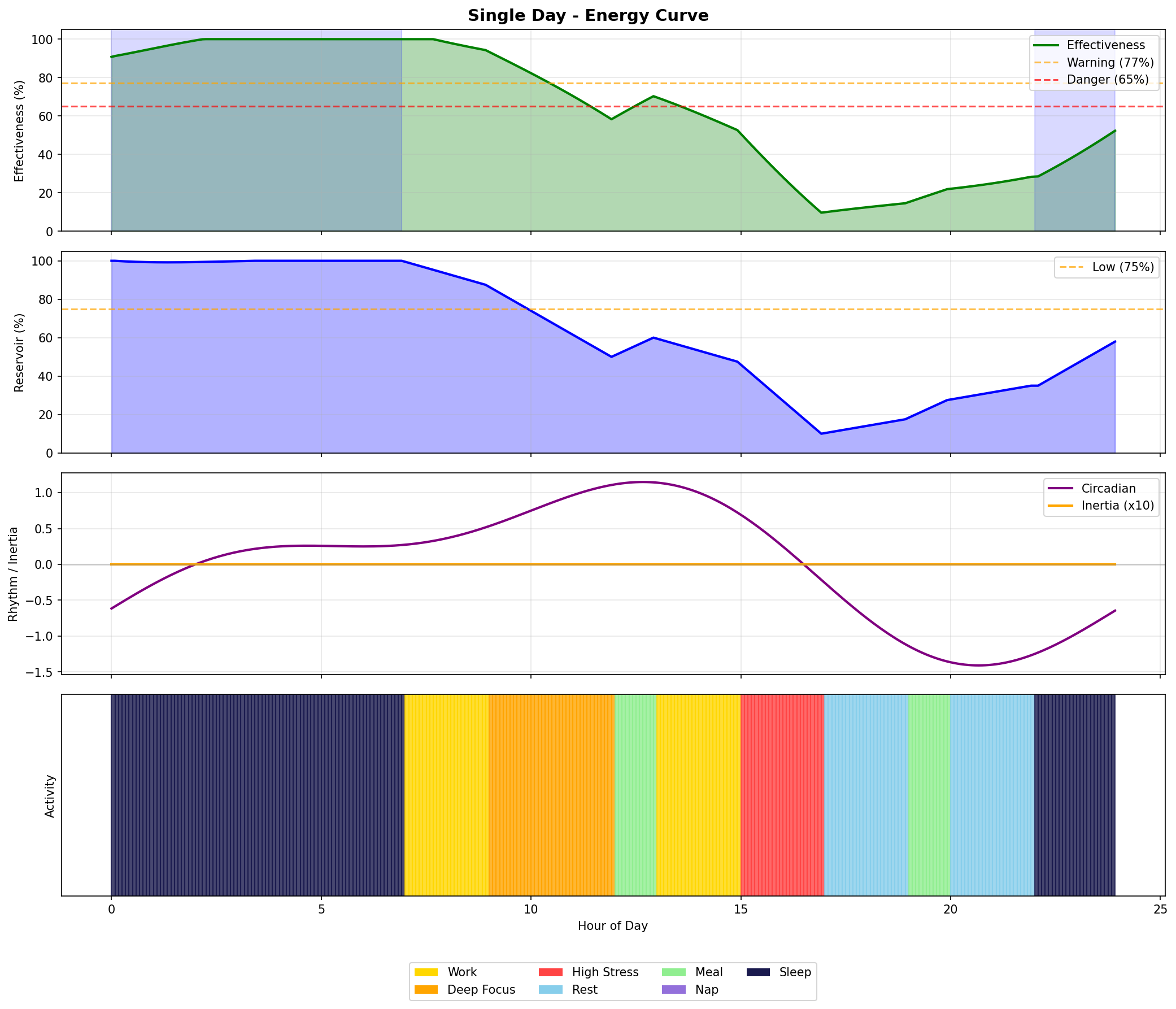
The circadian rhythm (purple line) peaks around 10 AM and dips around 4 PM. The reservoir (blue area) depletes throughout the day. Effectiveness (green line) combines both factors.
What the Model Reveals
The simulation made certain patterns undeniable:
- Deep focus is expensive. Three hours costs 36% of your reservoir.
- Stress compounds. Two hours of high-stress meetings after deep work can push you below critical.
- Recovery takes time. A 30-minute lunch doesn’t offset a 4-hour morning of intense work.
- Sleep is non-negotiable. It’s the only activity that fully restores the reservoir.
The fixes become obvious once you see the curves: add a power nap after lunch, break up deep focus blocks, reduce back-to-back meetings, go to bed earlier.
These aren’t revolutionary insights. But seeing them as shapes on a graph makes them harder to ignore.
Roughly Correct Rather Than Precisely Wrong
This phrase kept returning throughout the design process.
It would be easy to add complexity—more variables, more coefficients, more inputs. But a model that is precisely wrong about the wrong things is worse than one that is roughly correct about what matters.
What matters is the shape of the curve. When does energy typically dip? When does recovery happen? Where are the danger zones?
If the model helps someone notice that their schedule consistently crashes their energy by 3 PM, it has done its job—even if the exact percentage is off by five points.
From Simulation to Awareness
The deeper purpose isn’t prediction accuracy. It’s visibility.
When you can see your energy as a curve—not just feel it as vague tiredness—you start making different choices. You notice patterns. You experiment with changes. You treat yourself with more care because the consequences of not doing so become visible.
This is what measurement enables. Not control, but awareness. And awareness is the first step toward change.
What Comes Next
The simulation exists. It runs. It produces curves that feel real.
The next milestone is connecting it to actual physiological data—using Apple Watch signals like HRV and resting heart rate to adjust recovery estimates based on how well you actually slept, not just how long.
The formula is already designed:
Sleep Quality = 0.3 × HRV_modifier + 0.2 × RHR_modifier + 0.5 × DeepSleep_modifierBut that’s the next chapter.
For now, the model stands as a proof of concept: you can take an abstract idea like “energy” and make it concrete enough to simulate. The invisible becomes visible.
And once you can see it, you can begin to understand it.